Canva and Genially are both graphic design tools offering various services. Either software contains features that the other does not. Still, I’d say, in general, they deliver what they promise to provide to their users and are pretty similar to their approach.
This blog will focus on my experience using Canva to create an infographic. We’ve also written one for Genially. You can visit that by clicking here.
Experience in Using Canva for Infographics
Out of the bat, I would say that using Canva is straightforward and uncomplicated. It is the peak of drag-and-drop editing. You can choose to start from scratch if you are already comfortable with the software since that allows you additional freedom on what you can do, but using templates is totally acceptable.

There is no shame in that. That is what I did for my project. It’s simple, it saves my time, and it is enough to craft an infographic that is eye-catching and good enough to deliver the message that I intend to share.

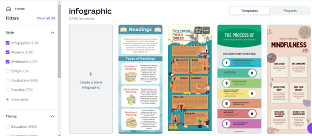
The general learning curve while using this software is gentle. I did not get lost navigating through its user interface. It is not overwhelming. Canva organizes everything in a manner that is easy to understand, even for new users. No tutorials are needed to familiarize yourself with this software. It is that instinctive. I enjoyed the filter feature a lot as there is a massive number of templates available for use. It is time-consuming to look at them individually to select the theme suitable for your topic.
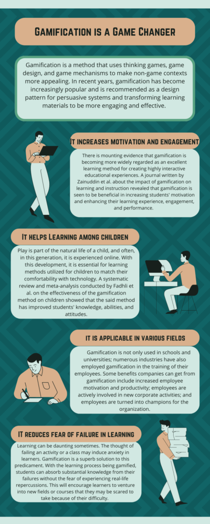
Creating the infographic did not take me too much time, especially the designing bit of it. As mentioned earlier, I used a template from Canva and altered its style using the presets offered by the software. There are also brandkits you can play with, which are combinations of different themes and fonts that can help you select the right style for your material. The things that took the most time were thinking about what content I should include in the infographic and adjusting the text sizes and headlines. Attached below is a photo of the material that we created from Canva.
Canva VS Genially: Which one is better?
Canva has a more extensive media library and template choices
After using them, I can say that Canva has more choices when it comes to templates. Their media gallery is also unmatched compared to Genially. There are fewer mediocre templates available on Canva. It feels like their team exerts extra effort to make sure that all the templates they include in their selection are of premium quality.
There is a massive price difference in the Pro subscription between the two software. Canva Pro is priced at $12.99/month, while Genially’s Edu Pro is $4.99 per month. Both are worth it to subscribe to. The Pro of
The Pro of Genially is sufficient to create great materials but if you want a more diverse and wide selection of media and templates, investing and committing to Canva is the wise decision.
Canva offers more features
I really enjoyed playing with the brandkit feature of Canva. It makes finding the perfect style for my infographic easier. Also, the shuffling of theme colors helps in this process. Their Pro subscription also comes with a nifty background remover. The 24/7 customer support is also a feature that can come in handy when unexpected problems arise.
You can download your outputs into PNG, JPG, GIF, PDF, etc on Canva
You cannot download your work on Genially without a subscription. And even with the Edu Pro subscription, the material will have its logo. You need to avail the Master plan to personalize this. In contrast, Canva allows you to download your material in a different format, even on their free plan. It also does not contain their watermark whatsoever. The ability to download your material gives you more flexibility since you can upload them upfront; no redirection is needed for the audience to see the material. Furthermore, a downloaded copy allows you to share the material offline.

