On-screen text readability improves by judicious color selection for the fonts and backgrounds in web and e-learning applications, which also has the added advantages of reducing unnecessary cognitive load and enhancing learning retention. Because there are more and more chances for online learning, instructional designers and web developers should consider a wise selection of colors and fonts when creating e-learning and web content.
We have listed below some tips web developers, instructional designers, teachers, and even students can apply to increase the accessibility of their material by choosing a better font style, color, and contrast.
1. High Luminance is Key
A way to evaluate contrast is luminance, which gauges how bright foreground components like text are compared to the background. As the luminance contrast between the background and the text can significantly impact readability, it is regarded as the most crucial determining element in the legibility of text and symbols.
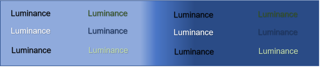
The figure above shows the difference in the readability of text with the same colors when put on a relatively fixed background. It showcases how luminance can affect the readability of texts and proves that this is a factor that course designers need to consider when choosing a color for their materials of web pages.
2. General Tips for Texts and Backgrounds
In a review of empirical research on color and contracts by Richardson et al., they discovered that using dark colors for texts is good for readability. Some of the top choices are black text on a white background and black text on a green background. These are options for those who prefer the opposite—white text on either blue or black background.
Using neutral colors such as grays and pastels is a good background choice. Blue-orange, red-green, and violet-yellow color combinations shall be avoided for texts and backgrounds. Designers should be wary of the overuse of primary colors as well and shall remember that gray backgrounds maximize contrast.
Other recommendations in the study to improve readability and increase learning retention by reducing unneeded cognitive load include reducing visual complexity, utilizing white space wisely, and judiciously integrating visual cues.
3. Use Sans-Serif Fonts
The fonts preferred according to the same literature review by Richardson et al. are sans serif fonts. According to its etymology, serif is derived from the old Dutch meaning “dash” or “line,” while sans is from the French meaning “without.” Hence, sans-serif fonts are fonts that do not have to extend features (serifs) at the end of each letter or stroke. Some of the most widely used sans serif fonts are Verdana, Tahoma, Arial, and Helvetica. These fonts deem to translate better on the web.
Rello and Baeza-Yates conducted a study to determine which fonts suit people with dyslexia. The key finding of their research is that font styles affect how easily persons with dyslexia can read. Helvetica, Courier, Arial, Verdana, and CMU are suitable fonts for people with dyslexia, considering reading ability and personal preferences. Moreover, sans serif is one of the fonts that are revealed to increase the reading performance of their respondents, while italicized fonts decrease reading performance.
4. Have the option to adjust colors and fonts
The design component that gives persons with impairments a flexible interface in terms of screen layout, including the ability to change colors and fonts, is an essential aspect of accessibility concerning flexibility in learning resources. As much as there are universal guidelines studied to suit everyone, some people still require different formats of texts, colors, contrast, and sizes. Having the feature to adjust elements in learning materials and websites mitigates this problem.
References
Harrison, M., Stockton, C., & Pearson, E. (2008). Inclusive, adaptive design for students with learning disabilities. 2008 Eighth IEEE International Conference on Advanced Learning Technologies. https://doi.org/10.1109/icalt.2008.34
Pittman, C. N., & Heiselt, A. K. (2014). Increasing Accessibility: Using Universal Design Principles to Address Disability Impairments in the Online Learning Environment. Online Journal of Distance Learning Administration, 17(3). Retrieved from http://www.westga.edu/~distance/ojdla/fall173/pittman_heiselt173.pdf.
Rello, L., & Baeza-Yates, R. (2013). Good fonts for dyslexia. Proceedings of the 15th International ACM SIGACCESS Conference on Computers and Accessibility. https://doi.org/10.1145/2513383.2513447
Richardson, R. T., Drexler, T. L., & Delparte, D. M. (2014). Color and Contrast in E-Learning Design: A Review of the Literature and Recommendations for Instructional Designers and Web Developers. MERLOT Journal of Online Learning and Teaching, 10(4). Retrieved from https://jolt.merlot.org/vol10no4/Richardson_1214.pdf.
Tandy, C., & Meacham, M. (2009). Removing the barriers for students with disabilities: Accessible online and web‐enhanced courses. Journal of Teaching in Social Work, 29(3), 313–328. https://doi.org/10.1080/08841230903022118